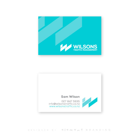
Needing a brand that could eventually be utilised in many media's (such as vehicles), we created an identity that uses a 'W' stylized to appear as lanes. These lanes further emphasize the companies purpose of establishing traffic management providing safety to the public road users and the contracting companies carrying out the road works and construction.
The colours were arranged to give a calm sense of cool, while also being able to be reversed and used in different formats.